Exploring the UX of web-annotations
Looking at Hypothesis, Genius and Google Docs
In my post experiments in networked writing I explored some ideas about how to put the network back in networked writing. In particular, I have a theory that the comments are actually the interesting unit of the blog, not the post.
The idea that blogs exist within the network is crucial to understanding the medium (the medium is the message - could one say the blogosphere is the blog?).
This has been bubbling in my mind for a long time with no satisfactory way forward but it came up again because of the Augmenting Human Intellect project which is going on right now. It looks like a lot of fun and is very interesting - it’s basically a crowd-swarm of in-line commenting on Douglas Engelbart’s famous paper Augmenting Human Intellect.
You can read the background on the project here.
And you can see the paper and annotations live here.
Great! Except… it all runs on top of Hypothesis. I know very little about them but it really seems like they’re trying very hard to build a robust, long-term utility for the web which is awesome. Except their UI leaves a lot to be desired. Especially on mobile.
So it felt like a good time to take a quick peek at a few common design patterns and think about some ways forward.
Hypothesis
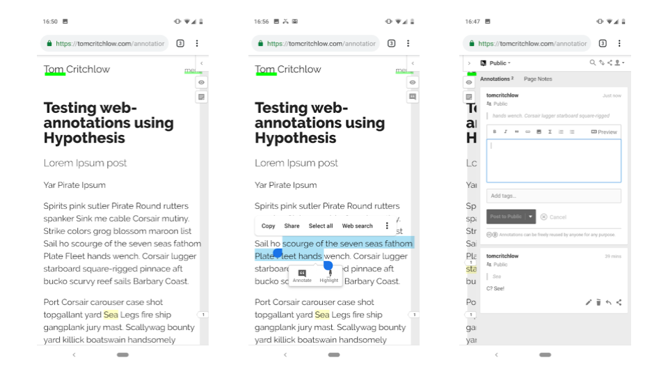
The Hypothesis annotation layer is typically displayed by default. You can see some common mobile screens here:

And you can play around with it yourself on this demo page I set up.
Some observations:
- By having the comment “drawer” on the side always on it is a very prominent and visual part of the page. It’s hard to implement without “getting in the way” of the page design. I’m sure there are options to install hidden by default but this default design pattern matters.
- The open and close UX interferes with the site’s UX (on my site for example opening and closing the drawer can interfere with the home, menu links causing a page transition)
- Features-wise, it’s the best tool out there - there’s options for public/private/closed groups, threading annotations, annotating PDFs and more. There’s also a robust ecosystem of tools to follow users, monitor site annotations etc.
- Note their new experimental UI is a little cleaner but still doesn’t feel like it’s a joy to use.
Genius
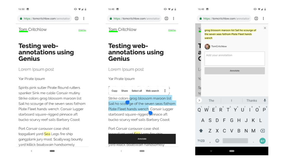
Genius is basically “the other” annotation layer for the web and is sometimes even used by “real” newsrooms. Likely because of the polished UI. Some common mobile screens:

And you can play around with it yourself on this demo page I set up.
Some observations:
- The annotation layer is hidden by default which feels like a more respectful design choice.
- The “X” to close the annotation layer is in the “right” place and doesn’t interfere with the page underneath.
- Overall the flow is much cleaner and more polished - everything from leaving an annotation to signing up is more familiar and clear.
- On desktop the “annotate” call to action is in-line but on mobile is a button at the bottom of the screen. This side-steps a bunch of UX headaches and makes it much easier to use.
- Genius is VC-backed and doesn’t have the cleanest track record so I have very little faith that you can rely on Genius for annotations in the long-term, or how they might be tracking you across the web when you interact with it.
Google Docs
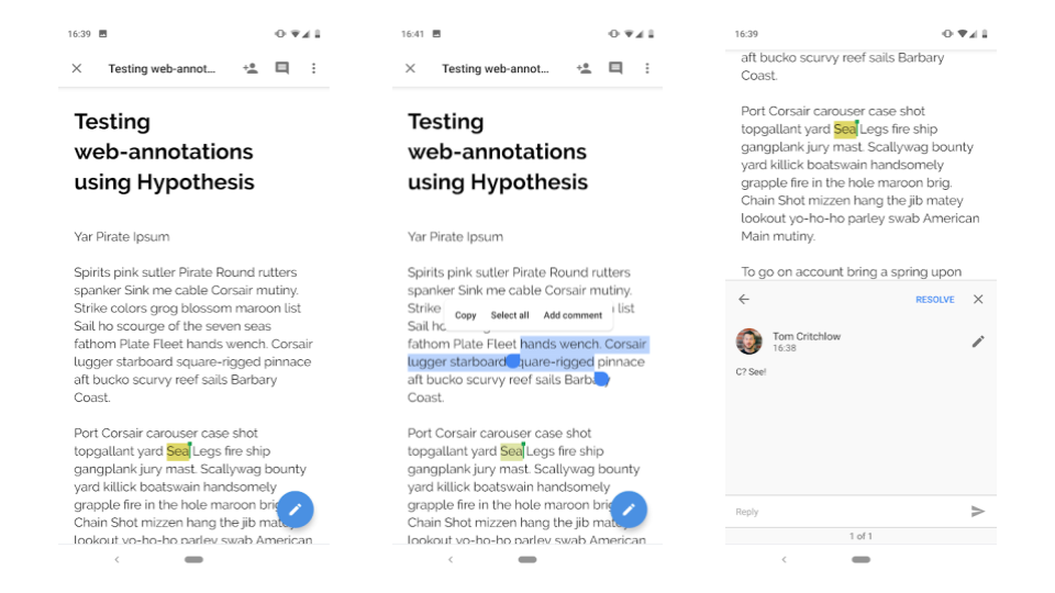
While Google docs certainly doesn’t feel very web-native and in some ways is pretty web-hostile they have a very robust workflow around commenting. I’d venture to say their commenting UX is best in class. I use it all day every day, on mobile and desktop. Some screens:

Obviously, they have a lot of advantage by being a native app but some observations:
- The ability to +mention someone in a comment is likely the killer feature for gdocs comments.
- By being a native app they get the ability to add “add comment” into the native highlight functionality which solves all of the traditional UX headaches
- The comment layer on mobile appears at the bottom of the screen and you can swipe through them horizontally which allows for viewing comments and content at once which is a very useful feature.
Ultimately, I’m betting on Hypothesis as the winner - I’d love to see them become more widely used. From what I can see their business is better structured to be a long-term stable and sustainable part of the open web. Hopefully they can adopt some of the UX patterns from Genius and Gdocs to make things smoother!
Twitter as the annotation layer for the web
There’s one “what if…” though.
Quartz has been dabbling in annotations ever since they launched. This is a screenshot of in-line annotations from 2013:

They walked that back a while ago but after their acquisition recently they have a commenting flow for members that allows you to share any URL with an “annotation” that you can share via Twitter. It creates a commenting layer of sorts for the web. See it in action by clicking the link here:
Wow. What a move. And good writing, even! via @qz https://t.co/n8ZTj42ugc
— Dan Frommer (@fromedome) February 7, 2019
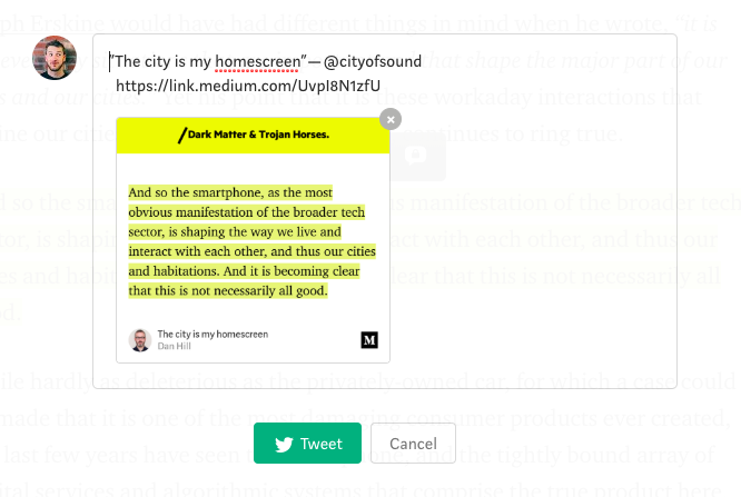
Medium also has a similar Tweet-based annotation flow that looks like this. Highlighting text shows the in-line tweet CTA:

And a custom image is generated showing the highlighted text which makes the whole flow feel very polished:

So, what if Twitter built an annotation / commenting platform that provided some of the same functionality to create in-line annotations and comments all anchored around Twitter with the conversation weaving back and forth between publisher site’s content and Twitter stream.
Seems like a long shot but it’s fun to dream. Still feels like Hypothesis is going to win here eventually. I’m rooting for them!
What am I missing about annotations for the web? I’m sure there’s a rich history here that I’m missing…
–
Update: I just installed hypothesis by default on this page too to test out some new UI and to expose by default some commentary that’s happening there too.
–
Update 2: The current hypothesis installed on this page is the gist below. Strongly considering putting it across all my blog posts. Provides the hypothesis functionality with a cleaner UX and hidden by default:
–
Update 3: Fascinating discussion around a new “link to specific word” web-spec here: https://news.ycombinator.com/item?id=19168442 (the usual disclaimers about HN being a garbage fire hold)
–
Update 4: Interesting usage of annotations as a way to make certain audiences feel included: https://twitter.com/frankshyong/status/1097986781503516672
–
Update 5: I realize now that I forgot to explain in this essay why annotations are important and interesting. To fall in love with marginalia and notes-on-texts check out Austin Kleon’s reading with a pencil post
August 22, 2025
June 27, 2025
Google is Grounded and Needs to Learn How to Soar
March 21, 2025
This post was written by Tom Critchlow - blogger and independent consultant. Subscribe to join my occassional newsletter: