Holding (and scrolling) attention
From doomscrolling to bloomscrolling
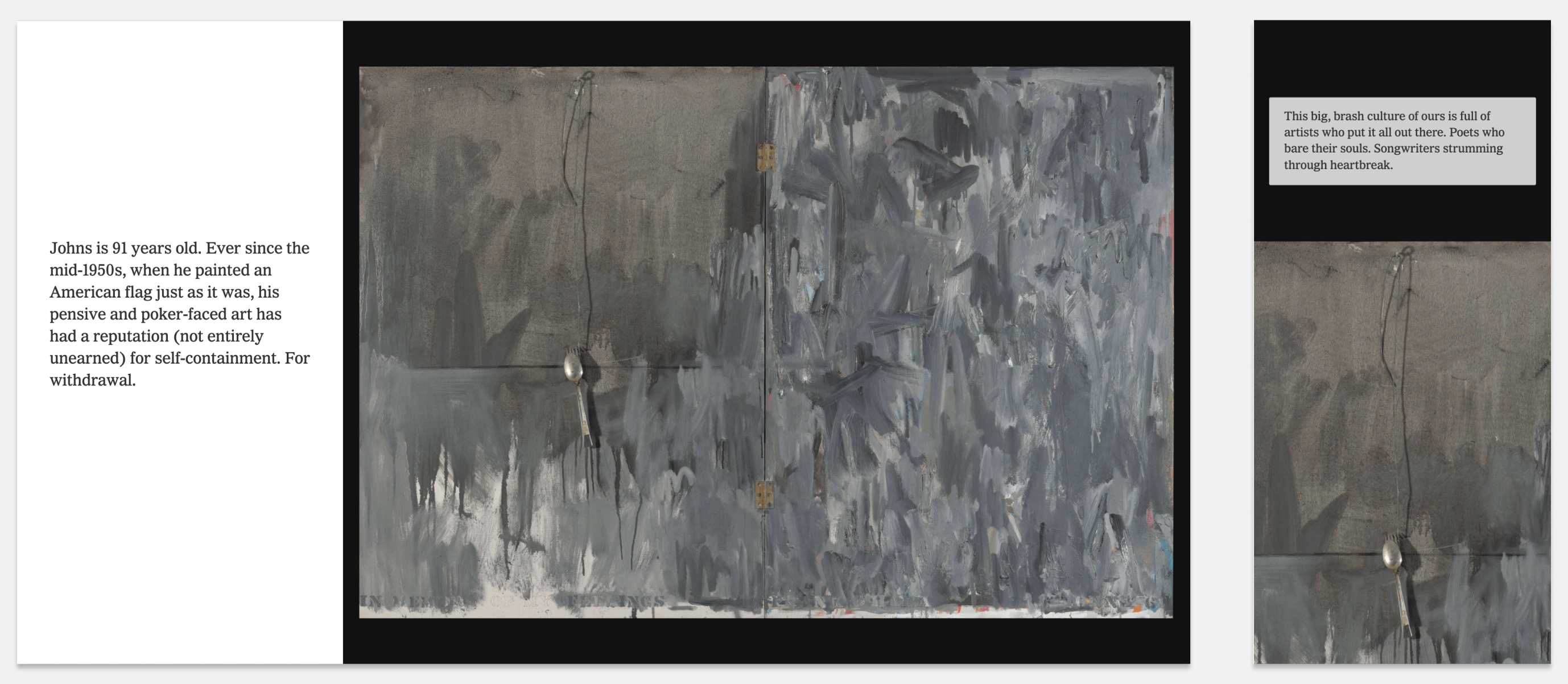
So there’s this thing that the NYTimes is doing right now and it’s kind of remarkable. Their close read series has a new scrolling format that guides you through a particular work of art. It’s a long scrolling format that combines insightful commentary, just enough detail to create a narrative but also leaves the work room to breathe.
It looks something like this:

It’s remarkable how this format is able to hold my attention. I’ve spent more time, looking more closely, at pieces of art online perhaps than I’ve ever done before? Sure, Google has had gigapixel zooming artworks online for ages but just because it’s a technical feat doesn’t engage me in the same way. Which piece to load up? Which area to zoom in on? What does it all mean?
The New York Times (perhaps unsurprisingly) has created a compelling combination of editorial and technology to create a very long, very engaging scrolling format. Try it yourself, I really enjoyed this piece How a Gray Painting Can Break Your Heart about a piece of work by Jasper Johns. I’ll wait.
The level of craft here is exceptional - not just the editorial craft, but the technical craft:
- How the piece scrolls fluidly on both desktop and mobile, never getting in the way
- The transitions between images that zoom in and out of the focus areas, not only drawing your attention but also enabling small screens to engage with artworks at both the macro and micro level
- The seamless loading of large image files, again in a way that never seems to interrupt the experience
I’m very excited to see a new digital format that can capture attention so well. Something that encourages close reading of the details. This is the opposite of what we think of as the digital experience!
Holding and scrolling my attention in an artful way.
But it gets more interesting. The latest close read explores a poem by W.H. Auden: A Poem (and a Painting) About the Suffering That Hides in Plain Sight. This scrolling experience mixes poetry with artworks! This kind of close read of a text online is rare! I’m always on the lookout for new ways to pay attention and to draw focus - I think it’s why I’m fascinated by annotations online.
I want the web to look and feel more like this every day!
This week in my undergrad class we used Miro for collaboratively reading and annotating a text. It was fun! pic.twitter.com/UlnYJ4X806
— Daniel Cardoso Llach ☀️ (@dcardo) February 16, 2021
Robin Sloan talks about this failure of digital a little in his latest newsletter:
I appreciate the way these looong scrolls challenge the presumed universality of our digital rectangle viewers. It’s basically impossible to take in a work of art like this on a laptop or phone; but hang it in a room, on a wall, and it becomes totally graspable. You can wander its length, peering at all the wonderful details.
Robin’s referring to the “Beijing Qingming scroll” a long horizontal artwork.
There’s still no complete way to experience an artwork like this through a screen but perhaps the NYTimes Close Read experience is making progress…
Of course some kind of prior art exists here. Two come to mind:
- Robin Sloan’s own fish: a tap essay feels like a similar way to capture and hold attention (and is all about close reading of things!)
- Robin Rendle’s scrolling essay on newsletters has a very similar feel to the NYTimes close read format, but without the smooth transitions. Still captivating!
Anyway. I don’t have a grand point except to shine a light on something well executed that manages to resist the doomscrolling experience….
Does an open source version of the NYTimes Close Read format exist? What other digital formats can hold your attention in this way? @-me! @tomcritchlow
–
Update #1: Reading around I found this overview of Scrollama.js and it seems like some new browser standards have enabled some fundamental advances in “scrollytelling” which this kind of format is… Now to fire up some experiments!
September 3, 2024
Working With Founders Who Have Conviction and Taste
April 16, 2024
This post was written by Tom Critchlow - blogger and independent consultant. Subscribe to join my occassional newsletter: